|

  
|
||
|
|
||
In this context a bubble plot lets you chart three variables in two dimensions by varying the size and/or color of each data point in a scatter plot based on a third variable. In DPlot, that third variable is taken from the Y values of a separate curve. The source curve for the bubble amplitudes will not be drawn. DPlot ignores the X values for the source curve(s); the n’th point of the source curve is used as the bubble amplitude for the n’th point of the selected curve, regardless of whether the X values match up. This command is disabled if only 1 curve is present in the plot.
If you want to use the amplitudes of a given curve for the bubble values for that same curve, you can do this by making a copy of that curve. Select Edit>Copy>Data Values, select the curve (if more than one curve is present), then Edit>Paste. For the Bubble amplitudes from curve, select the copy.
The low and high symbol sizes and colors are mapped to the low and high amplitudes from the source curve, respectively. If you want all symbols to be the same size, enter identical values for the low and high sizes. Likewise if you want all symbols to be the same color, select identical colors.
You can control the symbol type and colors used by right-clicking on any of the symbols in a bubble plot.
Line segments are not drawn between data points for bubble plots, though you can mix curves using bubbles with curves that do not use this feature.
Example
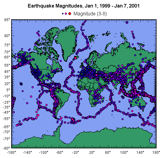
For more information on how this plot was created, see the Maps page on the DPlot web site.
|
Related macro commands |
Page url:
https://www.dplot.com/help/index.htm?helpid_bubbles.htm