|
How do I create a grain size distribution plot? |

  
|
|
How do I create a grain size distribution plot? |
|
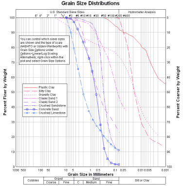
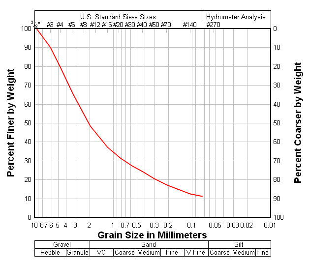
A grain size distribution plot is an XY plot with, typically, a reversed logarithmic scale on the X axis showing grain sizes and a linear percent finer scale on the Y axis. In addition, DPlot shows material classifications below the X axis and sieve sizes above the graph. An example of this type of plot is shown in example plot ex07.grf:
Example:
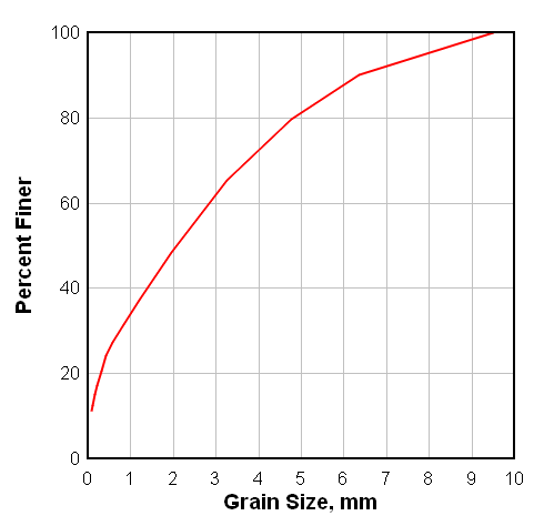
Select the data below, right-click and select Copy, then Paste into DPlot.
Grain Size, mm |
Percent Finer |
9.49431 |
100 |
6.3489 |
90.0497 |
4.76415 |
79.5579 |
3.25503 |
65.4762 |
1.95326 |
48.5495 |
1.19096 |
37.2581 |
0.823269 |
31.4927 |
0.580235 |
27.3879 |
0.419289 |
24.2034 |
0.302874 |
20.4645 |
0.208457 |
17.2875 |
0.154445 |
15.0234 |
0.105706 |
12.5868 |
0.0741779 |
11.0704 |
You will initially see a normal linear X, linear Y line graph:
Right-click within the box surrounding the plot and select "Grain Size Distribution":
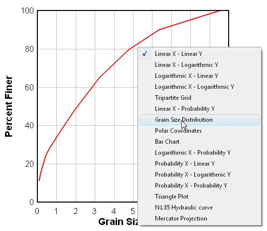
Alternatively, select Linear/Log Scaling>Grain Size Distribution on the Options menu. In either case this action will result in a grain size distribution plot with default settings:
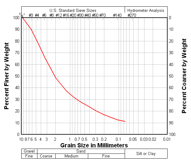
To change type-specific settings right-click within the plot again and select Grain Size Options. Each of the options are thoroughly described in the Grain Size Options topic. There you can choose to display Udden-Wentworth scale material classifications rather than the default AASHTO-standard sizes:
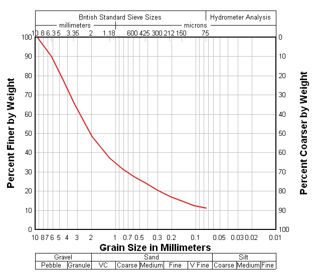
and/or British standard sieve sizes at the top of the plot instead of the default US standards:
You can also elect to display a custom list of sieve sizes at the top of the plot, or to draw bold vertical lines across the plot at material boundaries.
Page url:
https://www.dplot.com/help/index.htm?how_grainsize.htm