|

  
|
||
| Show/Hide Hidden Items |
|
|
||
| Show/Hide Hidden Items |
Available scaling options for XY plots are:
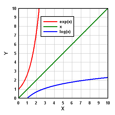
This is the default scaling for all new XY plots.
|
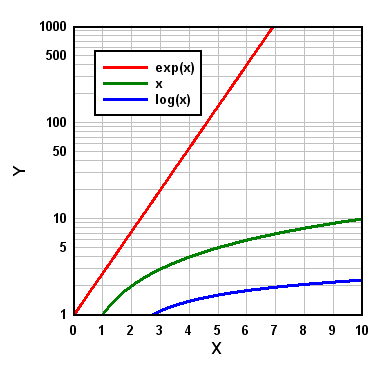
Y values must be > 0. Data points with Y=0 are ignored.
|
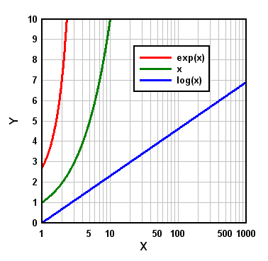
X values must be > 0. Data points with X=0 are ignored.
|
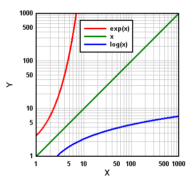
X and Y values must both be > 0. Data points with either X or Y=0 are ignored.
|
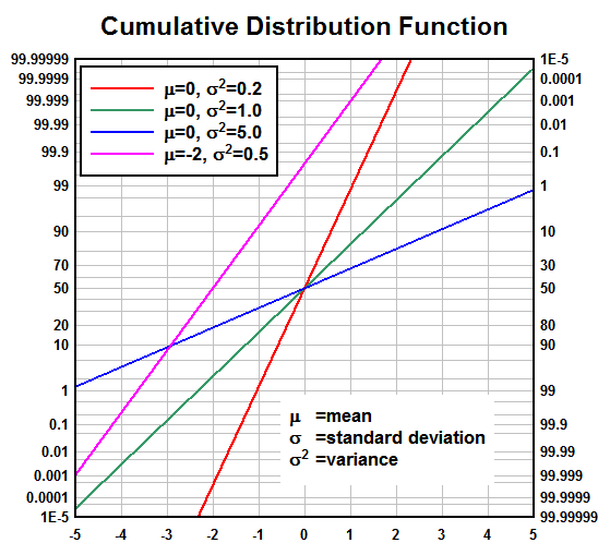
Amplitudes for probability scales must be in the range 0 < y < 100, or optionally 0 < y < 1. Values less than 0.00001 (1.E-5) or greater than 99.99999 (1.E-7 or 0.9999999 for a 0-1 range) are clipped. A Cumulative Distribution Function for a normally distributed variable will plot as a straight line using "Linear X - Probability Y" scaling:
|
![]() Logarithmic X, Probability Y
Logarithmic X, Probability Y
![]() Probability X, Linear Y
Probability X, Linear Y
![]() Probability X, Logarithmic Y
Probability X, Logarithmic Y
![]() Probability X, Probability Y
Probability X, Probability Y
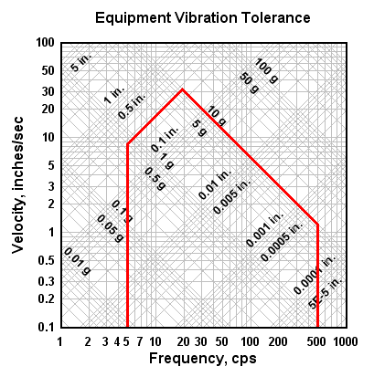
Tripartite grids are generally used to plot shock spectra for a given velocity record or fragility curves for shock-sensitive equipment. By default, a tripartite grid is set up for a shock spectra plot with X values = Frequency in Hertz, Y values = velocity in inches/sec, 45 degree lines = displacement in inches, and 135 degree lines = acceleration in g's. Units, the density of the acceleration and displacement lines, and the frequency of the acc./disp. labels may be changed with the Tripartite Options menu command.
The tripartite grid selection will override the grid type selection made with the Grid Lines or Box command. |
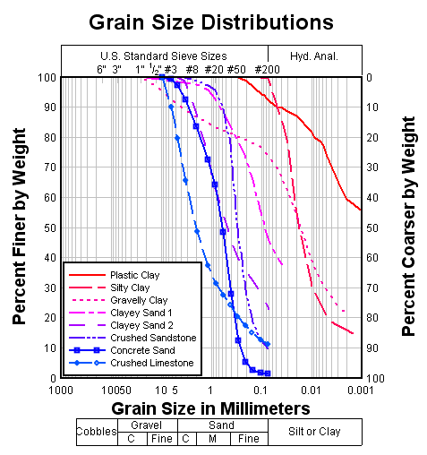
Amplitudes (percent finer values) for "Grain Size Distribution" scaling must be in the range 0 < y < 100, and the abscissa (grain sizes) must consist of positive values. Unlike all other scaling options, this option automatically fills in values for the X and Y axis labels, as well as a second Y axis label located on the right side of the plot. These labels may be changed, however, with the Title/Axes menu option.
By default, the grain size plot is set up for grain sizes in millimeters. A U.S. Standard Sieve scale will be drawn at the top edge of the plot, and a scale showing the range in size of common engineering materials is drawn below the X axis. These features require that the units of the grain sizes be known. The units may be changed with the Grain Size Options menu command. Grain size distribution plots will generally have a better appearance if you force the abscissa (X) to range from 0.001 mm to 1000. mm (or 0.00001 to 100. inches) using the Manual Scaling menu option. The grid type selection made with Grid Lines or Box is ignored. |
By default, angles are assumed to be in radians. Assumed angular units and the orientation of the plot may be changed with the Polar Plot Options menu command. Angles are displayed in degrees regardless of which unit type is in effect, unless the "Pi Multiples" or "Pi Fractions" number format is used for the X axis. The grid type selection made with Grid Lines or Box is ignored. |
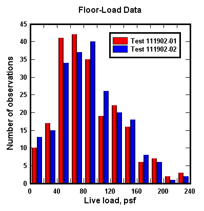
With multiple data sets, the abscissa must have a constant spacing for bar charts. If only one data set is used then the abscissa may have unequally-spaced values. X values are used as the lower limit of each bar, and the width of the bar is set to some fraction (default=1.0) of the spacing between points. The appearance of bar charts (filled or hollow, stacked or side-by-side, labeling bar amplitudes) may be controlled using the Bar Chart Options command. If you want the bars to begin at the associated X value, you can modify X to accomplish this. Use Edit>Operate on X with X=X-($X(1,2)-$X(1,1))/2 to shift the bars left by 1/2 the distance in X between the first 2 points in the first data set. |
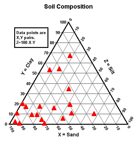
Triangle plots are useful for plotting various mixtures with 3 components (for example, soil is made up of sand, silt, and clay). The three components of each point (x, y, and z) always add up to 100. Since the components are therefore not independent, the points are completely determined by the x and y values. For more information on creating triangle plots see the topic for the example plot EX14.GRF.
As with polar coordinates, several menu options are disabled when viewing triangle plots. In particular, you cannot use the Zoom command or the Extents/Intervals /Size command to modify the plot extents. Also see the Always force symbols on/lines off for triangle plots option of the Options>General command. |
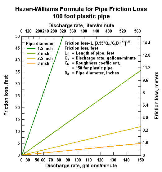
This graph type is typically used in hydraulic studies, particularly for fire suppression systems. The horizontal coordinates of the graph are scaled to the 1.85 power because, in the Hazen-Williams formula, pressure is proportional to the flow to the 1.85 power.
|
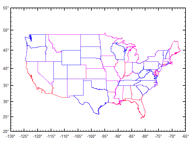
This scaling type is typically used for maps. Input values are limited to -360 < x < 360 and -85 < y < 85, where x is longitude in degrees and y is latitude in degrees. (DPlot will force the Amplitude Limits setting on for Mercator Projection and set the limits to +/- 85, so your input may contain latitudes outside those limits, that data will just be ignored.)
Although any number format may be used with this scaling, it is designed for Degrees, Minutes or Degrees, Minutes, Seconds and has no practical value for other formats.
The vertical axis with this scaling is increasingly stretched out at higher latitudes. This scaling was originally made popular by its ability to represent lines of constant true bearing as straight line segments. DPlot will automatically amend either the width or height of the plot such that the correct scaling is used. It will make this change, if necessary, regardless of whether the Specify size option of the Extents/Intervals/Size command is used. For predictable results with this scale type, use Extents/Intervals/Size, check the Specify size option and enter the desired width and height of the plot, then click the Set X:Y=1:1 button. Although DPlot will display longitudes as expected (-200° is displayed as 160°, for example), on input the data will be drawn with decreasing x values (longitudes) to increasing x values from left to right. Therefore if your map crosses longitude 180° and your input longitudes are positive in the Eastern hemisphere, negative in the Western hemisphere (as is standard practice), you will need to modify the longitudes for the map to be drawn correctly. This is easily done with the Operate on X command on the Edit menu with, for example, X=IF(X>0,X-360,X). |
Shortcut:
![]() Right-click within the graph.
Right-click within the graph.
|
Related macro commands |
See also:
Page url:
https://www.dplot.com/help/index.htm?helpid_scale.htm