|
|
Bar Charts
A bar chart, also known as a bar graph, is a chart with rectangular bars of lengths proportional to the magnitudes of what they represent. Bar
charts are used for comparing two or more values. In DPlot bar charts are simply a special case of XY plots. For example if you read the following
data using either File>Open with file type D or Edit>Paste:
(If you'd like to follow along with this example and you've already installed DPlot, select the table below by dragging your cursor over the
entire table, right click and select "Copy". In DPlot select Edit>Paste.)
| Floor-Load Data | | |
| Live load, psf | Test 111902-01 | Test 111902-02 |
| 0 | 10 | 13 |
| 20 | 17 | 15 |
| 40 | 41 | 34 |
| 60 | 42 | 37 |
| 80 | 35 | 40 |
| 100 | 19 | 26 |
| 120 | 22 | 20 |
| 140 | 16 | 18 |
| 160 | 6 | 8 |
| 180 | 7 | 6 |
| 200 | 2 | 1 |
| 220 | 3 | 2 |
| The data above will initially be presented as a normal XY plot: |
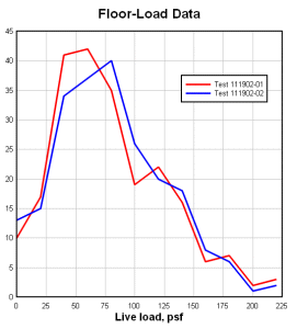 Bar Chart data on the default linear scale |
| To switch to a bar chart, right click on the plot and select "Bar Chart". |
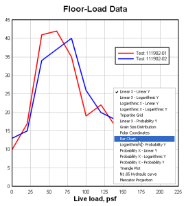 Right-click menu for XY plots |
| Depending on the default bar chart options (which you can change using this same step), you will probably now see a bar chart with vertical, hollow, side-by-side bars, as in the image to the right. You can change any of those bar chart characteristics and many more by right-clicking on the plot and selecting "Bar Chart Options". |
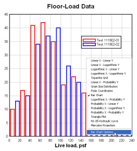 Bar chart with default options |
| For multiple data sets, bar charts may be drawn with bars side-by-side: |
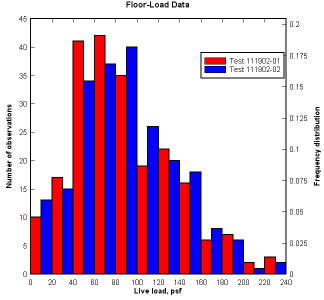 Bar Chart with side-by-side bars |
| or stacked: |
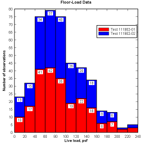 Bar Chart with stacked bars |
Labels with the bar's raw amplitude and/or the amplitude expressed as a percentage of the total may be drawn above
each bar or near the top of each bar. Percentages may optionally be a function of the total for all data sets, in the case of multiple sets.
Normally the X values for bar charts are (as with any other XY plot) numeric values. However you can use whatever labels you want along the X
axis by using the X,Y labels command on the Text menu. |
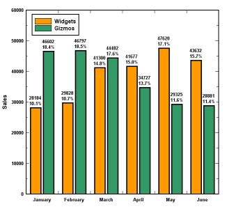 Bar Chart amplitude labels |
| Normally bars in the same data set are all drawn with the same color. You may optionally choose to draw each bar in a unique color: |
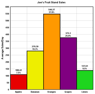 Bar Chart with unique colors for each bar |
| You can give bars a pseudo-3D look so that they appear to be cylindrical: |
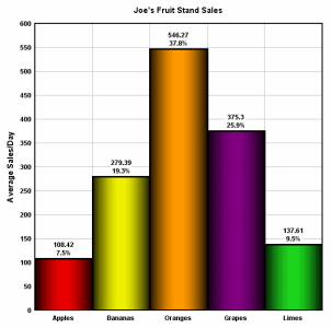 Bar Chart shading |
| Normally the input data for bar charts is evenly spaced along the ordinate (X axis). However, for unevenly-spaced data you
can elect to show the bars spanning the distance between X values: |
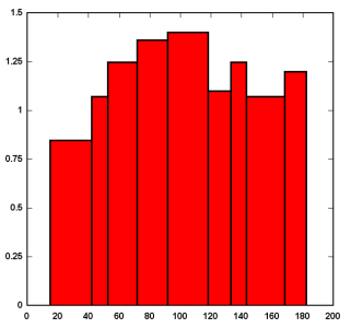 Bar Chart with unequal spacing |
| Yet another option is to draw a border only around the extremes of the chart, rather than full borders for each bar: |
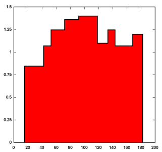 Bar Chart with outside border |
| DPlot includes several fill styles for bars other than hollow or solid. This might be handy when producing charts for black-and-white publication. |
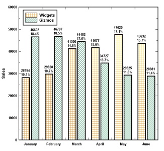 Bar Chart fill patterns |
| You can display horizontal bars with a couple of mouse clicks. DPlot will correctly swap the placement and/or orientation of axis labels, data point labels, extents and intervals. |
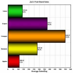 Bar Chart with horizontal bars |
|
RUNS ON
Windows 10,
Windows 8,
Windows 7, 2008,
Vista, XP, NT,
ME, 2003, 2000,
Windows 98, 95
|
|